The near-perfect case of dimensionality reduction
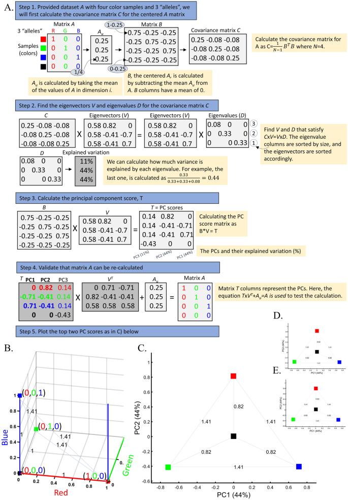
Applying principal component analysis (PCA) to a dataset of four populations sampled evenly: the three primary colors (Red, Green, and Blue) and Black illustrate a near-ideal dimension reduction example. PCA condensed the dataset of these four samples from a 3D Euclidean space (Fig. 1B) into three principal components (PCs), the first two of which explained 88% of the variation and can be visualized in a 2D scatterplot (Fig. 1C). Here, and in all other color-based analyses, the colors represent the true 3D structure, whereas their positions on the 2D plots are the outcome of PCA. Although PCA correctly positioned the primary colors at even distances from each other and Black, it distorted the distances between the primary colors and Black (from 1 in 3D space to 0.82 in 2D space). Thereby, even in this limited and near-perfect demonstration of data reduction, the observed distances do not reflect the actual distances between the samples (which are impossible to recreate in a 2D dataset). In other words, distances between samples in a reduced dimensionality plot do not and cannot be expected to represent actual genetic distances. Evenly increasing all the sample sizes yields identical results irrespective of the sample size (Fig. 1D,E).
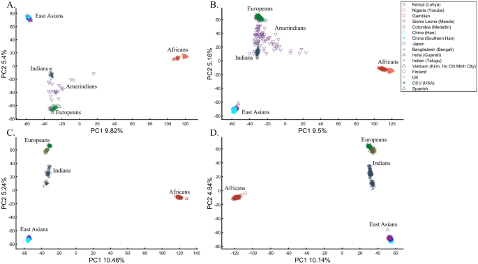
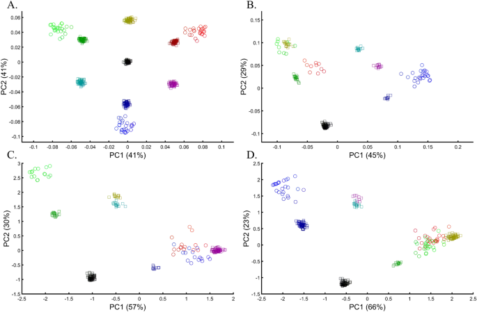
When analyzing human populations, which harbor most of the genomic variation between continental populations (12%) with only 1% of the genetic variation distributed within continental populations39, PCA tends to position Africans, Europeans, and East Asians at the corners of an imaginary triangle, which closely resembles our color-population model and illustration. Analyzing continental populations, we obtained similar results for two even-sized sample datasets (Fig. 2A,C) and their quadrupled counterparts (Fig. 2B,D). As before, the distances between the populations remain similar (Fig. 2A–D), demonstrating that for same-sized populations, sample size does not contribute to the distortion of the results if the increase in size is proportional.
The case of different sample sizes
The extent to which different-sized populations produce results with conflicting interpretations is illustrated through a typical study case in Box 1.
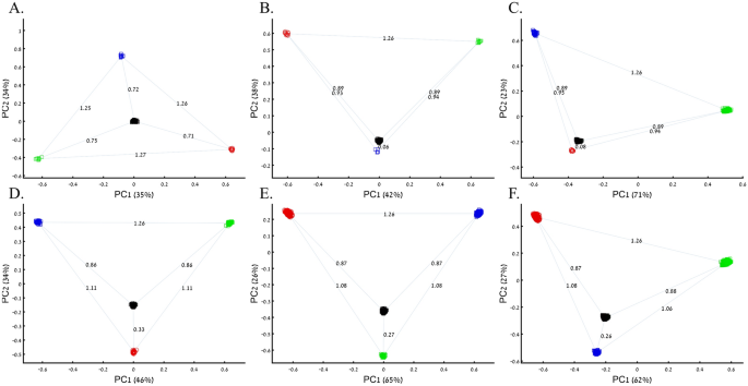
Note that unlike in Figs. 1C and 3A, where Black is in the middle, in other figures, the overrepresentation of certain “alleles” (e.g., Fig. 4B) shifts Black away from (0,0). Intuitively, this can be thought of as the most common “allele” (Green in Fig. 4B) repelling Black, which has three null or alternative “alleles”.
PCA is commonly reported as yielding a stable differentiation of continental populations (e.g., Africans vs. non-Africans, Europeans vs. Asians, and Asians vs. Native Americans or Oceanians, on the primary PCs40,41,42,43). This prompted prehistorical inferences of migrations and admixture, viewing the PCA results that position Africans, East Asians, and Europeans in three corners of an imaginary triangle as representing the post Out Of Africa event followed by multiple migrations, differentiation, and admixture events. Inferences for Amerindians or Aboriginals typically follow this reconstruction. For instance, Silva-Zolezzi et al.42 argued that the Zapotecos did not experience a recent admixture due to their location on the Amerindian PCA cluster at the Asian end of the European-Asian cline.
Here we show that the appearance of continental populations at the corners of a triangle is an artifact of the sampling scheme since variable sample sizes can easily create alternative results as well as alternative “clines”. We first replicated the triangular depiction of continental populations (Fig. 3A,B) before altering it (Fig. 3C–F). Now, East Asians appear as a three-way admixed group of Africans, Europeans, and Melanesians (Fig. 3C), whereas Europeans appear on an African-East Asian cline (Fig. 3D). Europeans can also be made to appear in the middle of the plot as an admixed group of Africans-Asians-Oceanians origins (Fig. 3E), and Oceanians can cluster with (Fig. 3F) or without East Asians (Fig. 3E). The latter depiction maximizes the proportion of explained variance, which common wisdom would consider the correct explanation. According to some of these results, only Europeans and Oceanians (Fig. 3C) or East Asians and Oceanians (Fig. 3D) experienced the Out of Africa event. By contrast, East Asians (Fig. 3C) and Europeans (Fig. 3D) may have remained in Africa. Contrary to Silva-Zolezzi et al.’s42 claim, the same Mexican–American cohort can appear closer to Europeans (Fig. 3A) or as a European-Asian admixed group (Fig. 3B). It is easy to see that none of those scenarios stand out as more or less correct than the other ones.
Reich et al.44 presented further PCA-based “evidence” to the ‘out of Africa’ scenario. Applying PCA to Africans and non-Africans, they reported that non-Africans cluster together at the center of African populations when PC1 was plotted against PC4 and that this “rough cluster[ing]” of non-Africans is “about what would be expected if all non-African populations were founded by a single dispersal ‘out of Africa.’” However, observing PC1 and PC4 for Supplementary Fig. S3, we found no “rough cluster” of non-Africans at the center of Africans, contrary to Reich et al.’s44 claim. Remarkably, we found a “rough cluster” of Africans at the center of non-Africans (Supplementary Fig. S3C), suggesting that Africans were founded by a single dispersal ‘into Africa’ by non-Africans. We could also infer, based on PCA, either that Europeans never left Africa (Supplementary Fig. S3D), that Europeans left Africa through Oceania (Supplementary Fig. S3B), that Asians and Oceanians never left Europe (or the other way around) (Supplementary Fig. S3F), or, since all are valid PCA results, all of the above. Unlike Reich et al.44, we do not believe that their example “highlights how PCA methods can provide evidence of important migration events”. Instead, our examples (Fig. 3, Supplementary Fig. S3) show how PCA can be used to generate conflicting and absurd scenarios, all mathematically correct but, obviously, biologically incorrect and cherry-pick the most favorable solution. This is an example of how vital a priori knowledge is to PCA. It is thereby misleading to present one or a handful of PC plots without acknowledging the existence of many other solutions, let alone while not disclosing the proportion of explained variance.
Box 1: Studying the origin of Black using the primary colors
Three research groups sought to study the origin of Black. A previous study that employed even sample-sized color populations alluded that Black is a mixture of all colors (Fig. 1B–D). A follow-up study with a larger sample size (nRed = nGreen = nBlue = 10) and enriched in Black samples (nBlack = 200) (Fig. 4A) reached the same conclusion. However, the Black-is-Blue group suspected that the Blue population was mixed. After QC procedures, the Blue sample size was reduced, which decreased the distance between Black and Blue and supported their speculation that Black has a Blue origin (Fig. 4B). The Black-is-Red group hypothesized that the underrepresentation of Green, compared to its actual population size, masks the Red origin of Black. They comprehensively sampled the Green population and showed that Black is very close to Red (Fig. 4C). Another Black-is-Red group contributed to the debate by genotyping more Red samples. To reduce the bias from other color populations, they kept the Blue and Green sample sizes even. Their results replicated the previous finding that Black is closer to Red and thereby shares a common origin with it (Fig. 4D). A new Black-is-Green group challenged those results, arguing that the small sample size and omission of Green samples biased the results. They increased the sample sizes of the populations of the previous study and demonstrated that Black is closer to Green (Fig. 4E). The Black-is-Blue group challenged these findings on the grounds of the relatively small sample sizes that may have skewed the results and dramatically increased all the sample sizes. However, believing that they are of Purple descent, Blue refused to participate in further studies. Their relatively small cohort was explained by their isolation and small effective population size. The results of the new sampling scheme confirmed that Black is closer to Blue (Fig. 4F), and the group was praised for the large sample sizes that, no doubt, captured the actual variation in nature better than the former studies.
The case of one admixed population
The question of who the ancestors of admixed populations are and the extent of their contribution to other groups is at the heart of population genetics. It may not be surprising that authors hold conflicting views on interpreting these admixtures from PCA. Here, we explore how an admixed group appears in PCA, whether its ancestral groups are identifiable, and how its presence affects the findings for unmixed groups through a typical study case (Box 2).
To understand the impact of parameter choices on the interpretation of PCA, we revisited the first large-scale study of Indian population history carried out by Reich et al.45. The authors applied PCA to a cohort of Indians, Europeans, Asians, and Africans using various sample sizes that ranged from 2 (Srivastava) (out of 132 Indians) to 203 (Yoruban) samples. After applying PCA to Indians and the three continental populations to exclude “outliers” that supposedly had more African or Asian ancestries than other samples, PCA was applied again in various settings.
At this point, the authors engaged in circular logic as, on the one hand, they removed samples that appeared via PCA to have experienced gene flow from Africa (their Note 2, iii) and, on the other hand, employed a priori claim (unsupported by historical documents) that “African history has little to do with Indian history” (which must stand in sharp contrast to the rich history of gene flow from Utah (US) residents to Indians, which was equally unsupported). Reich et al. provided no justification for the exact protocol used or any discussion about the impact of using different parameter values on resulting clusters. They then generated a plethora of conflicting PCA figures, never disclosing the proportion of explained variance along with the first four PCs examined. They then inferred based on PCA that Gujarati Americans exhibit no “unusual relatedness to West Africans (YRI) or East Asians (CHB or JPT)” (Supplementary Fig. S4)45. Their concluding analysis of Indians, Asians, and Europeans (Fig. 4)45 showed Indians at the apex of a triangle with Europeans and Asians at the opposite corners. This plot was interpreted as evidence of an “ancestry that is unique to India” and an “Indian cline”. Indian groups were explained to have inherited different proportions of ancestry from “Ancestral North Indians” (ANI), related to western Eurasians, and “Ancestral South Indians” (ASI), who split from Onge. The authors then followed up with additional analyses using Africans as an outgroup, supposedly confirming the results of their selected PCA plot. Indians have since been described using the terms ANI and ASI.
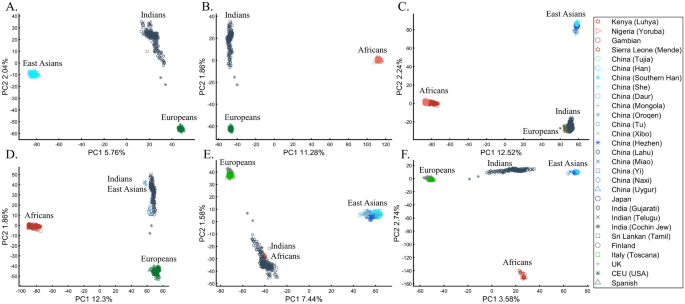
In evaluating the claims of Reich et al.45 that rest on PCA, we first replicated the finding of the alleged “Indian cline” (Fig. 5A). We next garnered support for an alternative cline using Indians, Africans, and Europeans (Fig. 5B). We then demonstrated that PCA results support Indians to be European (Fig. 5C), East Asians (Fig. 5D), and Africans (Fig. 5E), as well as a genuinely European-Asian, admixed population (Fig. 5F). Whereas the first two PCs of Reich et al.’s primary figure explain less than 8% of the variation (according to our Fig. 5A, Reich et al.’s Fig. 4 does not report this information), four out of five of our alternative depictions explain 8–14% of the variation. Our results also expose the arbitrariness of the scheme used by Reich et al. and show how radically different clustering can be obtained merely by manipulating the non-Indian populations used in the analyses. Our results also question the authors’ choice in using an analysis that explained such a small proportion of the variation (let alone not reporting it), yielded no support for a unique ancestry to India, and cast doubt on the reliability and usefulness of the ANI-ASI model to describe Indians provided their exclusive reliability on a priori knowledge in interpreting the PCA patters. Although supported by downstream analyses, the plurality of PCA results could not be used to support the authors’ findings because using PCA, it is impossible to answer a priori whether Africa is in India or the other way around (Fig. 5E). We speculate tat the motivation for Reich et al.'s strategy was to declare Africans an outgroup, an essential component of D-statistics. Clearly, PCA-based a posteriori inferences can lead to errors of Colombian magnitude.
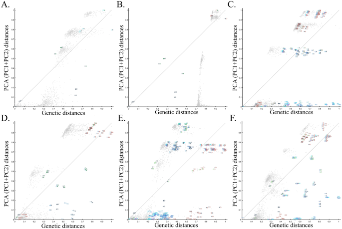
To evaluate the extent of deviation of PCA results from genetic distances, we adopted a simple genetic distance scheme where we measured the Euclidean distance between allelic counts (0,1,2) in the same data used for PCA calculations. We are aware of the diversity of existing genetic distance measures. However, to the best of our knowledge, no study has ever shown that PCA outcomes numerically correlate with any genetic distance measure, except in very simple scenarios and tools like ADMIXTURE-like tools, which, like PCA, exhibit high design flexibility. Plotting the genetic distances against those obtained from the top two PCs shows the deviation between these two measures for each dataset. We found that all the PC projections (Fig. 6) distorted the genetic distances in unexpected ways that differ between the datasets. PCA correctly represented the genetic distances for a minority of the populations, and just like the most poorly represented populations—none were distinguishable from other populations. Moreover, populations that clustered under PCA exhibited mixed results, questioning the accuracy of PCA clusters. Although it remains unclear which sampling scheme to adopt, neither scheme is genetically accurate. These results further question the genetic validity of the ANI-ASI model.
We are aware that PCA disciples may reject our reductio ad absurdum argument and attempt to read into these results, as ridiculous as they may be, a valid description of Indian ancestry. For those readers, demonstrating the ability of the experimenter to generate near-endless contradictory historical scenarios using PCA may be more convincing or at least exhausting. For brevity, we present six more such scenarios that show PCA support for Indians as a heterogeneous group with European admixture and Mexican-Americans as an Indian-European mixed population (Supplementary Fig. S4A), Mexican–American as an admixed African-European group with Indians as a heterogeneous group with European admixture (Supplementary Fig. S4B), Indians and Mexican-Americans as European-Japanese admixed groups with common origins and high genetic relatedness (Supplementary Fig. S4C), Indians and Mexican-Americans as European-Japanese admixed groups with no common origins and genetic relatedness (Supplementary Fig. S4D), Europans as Indian and Mexican-Americans admixed group with Japanese fully cluster with the latter (Supplementary Fig. S4E), and Japanese and Europeans cluster as an admixed Indian and Mexican-Americans groups (Supplementary Fig. S4F). Readers are encouraged to use our code to produce novel alternative histories. We suspect that almost any topology could be obtained by finding the right set of input parameters. In this sense, any PCA output can reasonably be considered meaningless.
Contrary to Reich et al.'s claims, a more common interpretation of PCA is that the populations at the corners of the triangle are ancestral or are related to the mixed groups within the triangle, which are the outcome of admixture events, typically referred to as “gradient” or “clines45”. However, some authors held different opinions. Studying the African component of Ethiopian genomes, Pagani et al.46 produced a PC plot showing Europeans (CEU), Yoruba (western African), and Ethiopians (Eastern Africans) at the corners of a triangle (Supplementary Fig. S4)46. Rather than suggesting that the populations within the triangle (e.g., Egyptians, Spaniards, Saudi) are mixtures of these supposedly ancestral populations, the authors argued that Ethiopians have western and eastern African origins, unlike the central populations with “different patterns of admixture”. Obviously, neither interpretation is correct. Reich et al.’s interpretation does not explain why CEUs are not an Indian-African admix nor why Africans are not a European-Indian admix and is analogous to arguing that Red has Green and Blue origins (Fig. 1). Pagani et al.’s interpretation is a tautology, ignores the contribution of non-Africans, and is analogous to arguing that Red has Red and Green origins. We carried out forward simulations of populations with various numbers of ancestral populations and found that admixture cannot be inferred from the positions of samples in a PCA plot (Supplementary Text 1).
In a separate effort to study the origins of AJs, Need et al.47 applied PCA to 55 Ashkenazic Jews (AJs) and 507 non-Jewish Caucasians. Their PCA plot showed that AJs (marked as “Jews”) formed a distinct cluster from Europeans (marked as “non-Jews”). Based on these results, the authors suggested that PCA can be used to detect linkage to Jewishness. A follow-up PCA where Middle Eastern (Bedouin, Palestinians, and Druze) and Caucasus (Adygei) populations were included showed that AJs formed a distinct cluster that nested between the Adygei (and the European cluster) and Druze (and the Middle Eastern cluster). The authors then concluded that AJs might have mixed Middle Eastern and European ancestries. The proximity to the Adygei cluster was noted as interesting but dismissed based on the small sample size of the Adygei (n = 17). The authors concluded that AJ genomes carry an “unambiguous signature of their Jewish heritage, and this seems more likely to be due to their specific Middle Eastern ancestry than to inbreeding”. A similar strategy was employed by Bray et al.48 to claim that PCA “confirmed that the AJ individuals cluster distinctly from Europeans, aligning closest to Southern European populations along with the first principal component, suggesting a more southern origin, and aligning with Central Europeans along the second, consistent with migration to this region.” Other authors49,50 made similar claims.
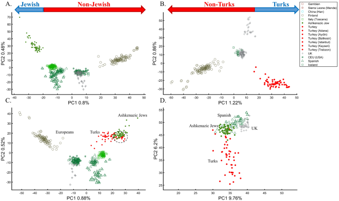
It is easy to show why PCA cannot be used to reach such conclusions. We first replicated Need et al.’s47 primary results (Fig. 7A), showing that AJs cluster separately from Europeans. However, such an outcome is typical when comparing Europeans and non-European populations like Turks (Fig. 7B). It is not unique to AJs, nor does it prove that they are genetically detectable. A slightly modified design shows that most AJs overlap with Turks in support of the Turkic (or Near Eastern) origin of AJs (Fig. 7C). We can easily refute our conclusion by including continental populations and showing that most AJs cluster with Iberians rather than Turks (Fig. 7D). This last design explains more of the variance than all the previous analyses together, although, as should be evident by now, it is not indicative of accuracy. This analysis questions PCA's use as a discriminatory genetic utility and to infer genetic ancestry.
There are several more oddities with the report of Need et al.47. First, they did not report the variance explained by their sampling scheme (it is, likely, ~1%, as in Fig. 7A). Second, they misrepresented the actual populations analyzed. AJs are not the only Jews, and Europeans are not the only non-Jews (Figs. 1, 7A)47. Finally, their dual interpretations of AJs as a mixed population of Middle Eastern origin are based solely on a priori belief: first, because most of the populations in their PCA are nested between and within other populations, yet the authors did not suggest that they are all admixed and second because AJs nested between Adygii and Druze51,52, both formed in the Near Eastern. The conclusions of Need et al.47 were thereby obtained based on particular PCA schemes and what may be preconceived ideas of AJs origins that are no more real than the Iberian origin of AJs (Fig. 7D). This is yet another demonstration (discussed in Elhaik36) of how PCA can be misused to promote ethnocentric claims due to its design flexibility.
Box 2: Studying the origin of Black using the primary and one secondary (admixed) color populations
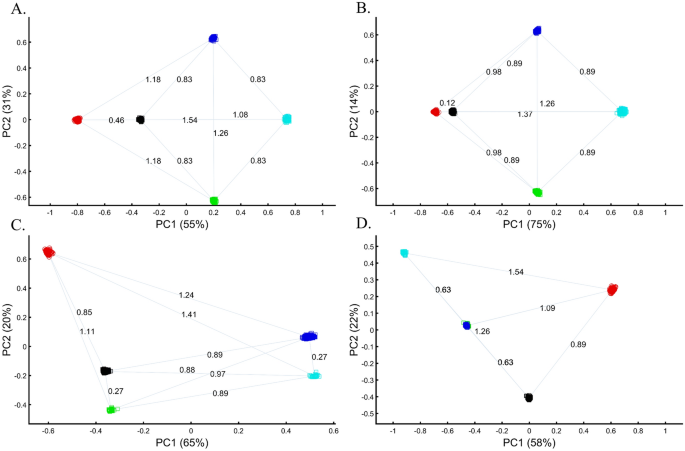
Following criticism on the sampling scheme used to study the origin of Black (Box 1), the redoubtable Black-is-Red group genotyped Cyan. Using even sample sizes, they demonstrated that Black is closer to Red (DBlack-Red = 0.46) (Fig. 8A), where D is the Euclidean distance between the samples over all three PCs (short distances indicate high similarity). The Black-is-Green school criticized their findings on the grounds that their Cyan samples were biased and their results do not apply to the broad Black cohort. They also reckoned that the even sampling scheme favored Red because Blue is related to Cyan through shared language and customs. The Black-is-Red group responded by enriching their cohort in Cyan and Black (nCyan, nBlack = 1000) and provided even more robust evidence that Black is Red (DBlack-Red = 0.12) (Fig. 8B). However, the Black-is-Green camp dismissed these findings. Conscious of the effects of admixture, they retained only the most homogeneous Green and Cyan (nGreen, nCyan = 33), genotyped new Blue and Black (nBlue, nBlack = 400), and analyzed them with the published Red cohort (nRed = 100). The Black-is-Green results supported their hypothesis that Black is Green (DBlack-Green = 0.27) and that Cyan shared a common origin with Blue (DBlue-Green = 0.27) (Fig. 8C) and should thereby be considered an admixed Blue population. Unsurprisingly, the Black-is-Red group claimed that these results were due to the under-representation of Black since when they oversampled Black, PCA supported their findings (Fig. 8A). In response, the Black-is-Green school maintained even sample sizes for Cyan, Blue, and Green (nBlue, nGreen, nCyan = 33) and enriched Black and Red (nRed, nBlack = 100). Not only did their results (DBlack-Green = 0.63 < DBlack-Red = 0.89) support their previous findings, but they also demonstrated that Green and Blue completely overlapped, presumably due to their shared co-ancestry, and that together with Cyan (DCyan-Green = 0.63 < DCyan-Red = 1.09) (Fig. 8B,D) they represent an antique color clade. They explained that these color populations only appeared separated due to genetic drift. However, they still retained sufficient cryptic genetic information that PCA can uncover if the correct sampling scheme is used. Further analyses by the other groups contested these findings (Supplementary Fig. S5A-D). Among else, it was argued that Black is a Green–Red admixed group (Supplementary Fig. S5C) and that Black and Cyan were the ancestors of Blue and Green (Supplementary Fig. S5D).
The case of a multi-admixed population
The question of how analyzing admixed groups with multiple ancestral populations affects the findings for unmixed groups is illustrated through a typical study case in Box 3.
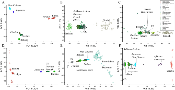
To understand how PCA can be misused to study multiple mixed populations, we will investigate other PCA applications to study AJs. Such analyses have a thematic intepretation, where the clustering of AJ samples is evidence of a shared Levantine origin, e.g., Refs.12,13, that “short” distances between AJs and Levantines indicate close genetic relationships in support of a shared Levantine past, e.g., Ref.12, whereas the “short” distances between AJs and Europeans are evidence of admixture13. Finally, as a rule, the much shorter distances between AJs and the Caucasus or Turkish populations, observed by all recent studies, were ignored12,13,47,48. Bray et al.48 concluded that not only do AJs have a “more southern origin” but that their alignment with Central Europeans is “consistent with migration to this region”. In these studies, "short" and “between” received a multitude of interpretations. For example, Gladstein and Hammer's53 PCA plot that showed AJs in the extreme edge of the plot with Bedouins and French in the other edges was interpreted as AJs clustering “tightly between European and Middle Eastern populations”. The authors interpreted the lack of “outliers” among AJs (which were never defined) as evidence of common AJ ancestry.
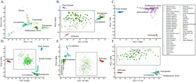
Following the rationale of these studies, it is easy to show how PCA can be orchestrated to yield a multitude origins for AJs. We replicated the observation that AJs are “population isolate,” i.e., AJs form a distinct group, separated from all other populations (Fig. 9A), and are thereby genetically distinguishable47. We also replicated the most common yet often-ignored observation, that AJs cluster tightly with Caucasus populations (Fig. 9B). We next produced novel results where AJs cluster tightly with Amerindians due to the north Eurasian or Amerindian origins of both groups (Fig. 9C). We can also show that AJs cluster much closer to South Europeans than Levantines (Fig. 9D), and overlap Finns entirely, in solid evidence of AJ’s ancient Finnish origin (Fig. 9E). Last, we wish to refute our previous finding and show that only half of the AJs are of Finnish origin. The remaining analysis supports the lucrative Levantine origin (Fig. 9F)—a discovery touted by all the previous reports though never actually shown. Excitingly enough, the primary PCs of this last Eurasian Finnish-Levantine mixed origin depiction explained the highest amount of variance. An intuitive interpretation of those results is a recent migration of the Finnish AJs to the Levant, where they experienced high admixture with the local Levantine populations that altered their genetic background. These examples demonstrate that PCA plots generate nonsensical results for the same populations and no a posteriori knowledge.
Box 3: Studying the origin of Black using the primary and multiple mixed colors
The value of using mixed color populations to study origins prompted new analyses using even (Fig. 10A) and variable sample sizes (Fig. 10B–D). Using this novel sampling scheme, the Black-is-Green school reaffirmed that Black is the closest to Green (Fig. 10A, 10C, and 10D) in a series of analyses, but using a different cohort yielded a novel finding that Black is closest to Pink (Fig. 10B).
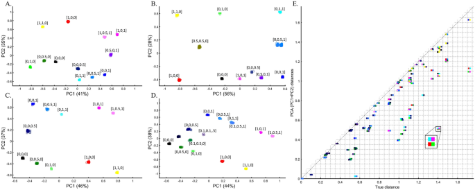
The extent to which PCA distances obtained by the top two PCs reflect the true distances among color population pairs is shown in Fig. 10E. PCA distorted the distances between most color populations, but the distortion was uneven among the pairs, and while a minority of the pairs are correctly projected via PCA, most are not. Identifying which pairs are correctly projected is impossible without a priori information. For example, some shades of blue and purple were less biased than similar shades. We thereby show that PCA inferred distances are biased in an unpredicted manner and thereby uninformative for clustering.
The case of multiple admixed populations without “unmixed” populations
Unlike stochastic models that possess inherent randomness, PCA is a deterministic process, a property that contributes to its perceived robustness. To explore the behavior of PCA, we tested whether the same computer code can produce similar or different results when the only variable that changes is the standard randomization technique used throughout the paper to generate the individual samples of the color populations (to avoid clutter).
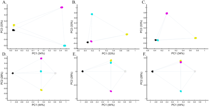
We evaluated two color sets. In the first set, Black was the closest to Yellow (Fig. 11A), Purple (Fig. 11C), and Cyan (Fig. 11D,E). When adding White, in the second set, Black behaved as an outgroup as the distances between the secondary colors largely deviated from the expectation and produced false results (Fig. 11D–F). These results illustrate the sensitivity of PCA to tiny changes in the dataset, unrelated to the populations or the sample sizes.
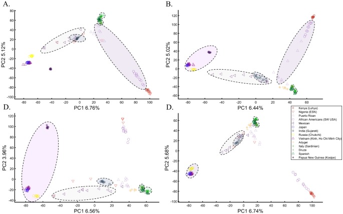
To explore this effect on human populations, we curated a cohort of 16 populations. We carried out PCA on ten random individuals from 15 random populations. We show that these analyses result in spurious and conflicting results (Fig. 12). Puerto Ricans, for instance, clustered close to Europeans (A), between Africans and Europeans (B), close to Adygei (C), and close to Europe and Adygei (D). Indians clustered with Mexicans (A, B, and D) or apart from them (C). Mexicans themselves cluster with (A and D) or without (B and C) Africans. Papuans and Russians cluster close (B) or afar (C) from East Asian populations. More robust clustering was observed for East Asians, Caucasians, and Europeans, as well as Africans. However, these were not only indistinguishable from the less robust clustering but also failed to replicate over multiple runs (results not shown). These examples show that PCA results are unpredictable and irreproducible even when 94% of the populations are the same. Note that the proportion of explained variance was similar in all the analyses, demonstrating that it is not an indication of accuracy or robustness.
We found that although a deterministic process, PCA behaves unexpectedly, and minor variations can lead to an ensemble of different outputs that appear stochastic. This effect is more substantial when continental populations are excluded from the analysis.
The cases of case–control matching and GWAS
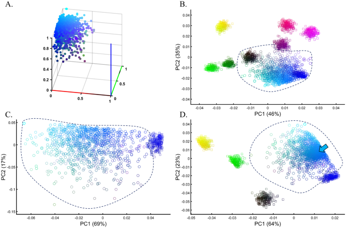
Samples of unknown ancestry or self-reported ancestry are typically identified by applying PCA to a cohort of test samples combined with reference populations of known ancestry (e.g., 1000 Genomes), e.g., Refs.22,54,55,56. To test whether using PCA to identify the ancestry of an unknown cohort with known samples is feasible, we simulated a large and heterogeneous Cyan population (Fig. 13A, circles) of self-reported Blue ancestry. Following a typical GWAS scheme, we carried out PCA for these individuals and seven known and distinct color populations. PCA grouped the Cyan individuals with Blue and Black individuals (Fig. 13B), although none of the Cyan individuals were Blue or Black (Fig. 13A), as a different PCA scheme confirmed (Fig. 13C). A case–control assignment of this cohort to Blue or Black based on the PCA result (Fig. 13B) produced poor matches that reduced the power of the analysis. When repeating the analysis with different reference populations (Fig. 13D), the simulated individuals exhibited minimal overlap with Blue, no overlap with Black, and overlapped mostly with the Cyan reference population present this time. We thereby showed that the clustering with Blue and Black is an artifact due to the choice of reference populations. In other words, the introduction of reference populations with mismatched ancestries respective to the unknown samples biases the ancestry inference of the latter.
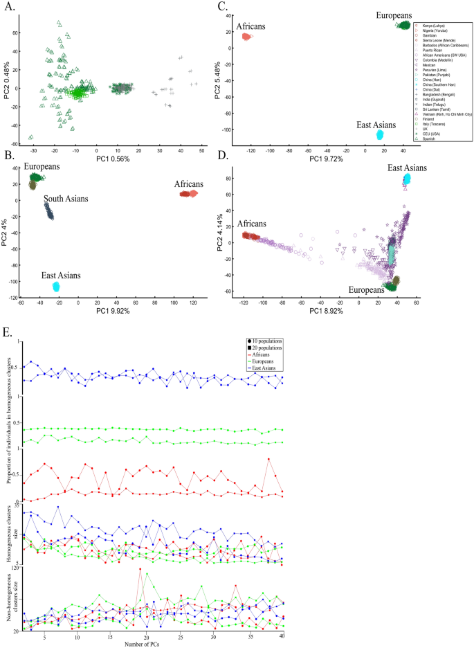
We next asked whether PCA results can group Europeans into homogeneous clusters. Analyzing four European populations yielded 43% homogeneous clusters (Fig. 14A). Adding Africans and Asians and then South Asian populations decreased the European cluster homogeneity to 14% and 10%, respectively (Fig. 14B,C). Including the 1000 Genome populations, as customarily done, yielded 14% homogeneous clusters (Fig. 14D). Although the Europeans remained the same, the addition of other continental populations resulted in a three to four times decrease in the homogeneity of their clusters.
The number of PCs analyzed in the literature ranges from 2 to, at least, 28035, which raises the question of whether using more PCs increases cluster homogeneity or is another cherry-picking strategy. We calculated the cluster homogeneity for different PCs for either 10 or 20 African (n10 = 337, n20 = 912), Asian (n10 = 331, n20 = 785), and European (n10 = 440, n20 = 935) populations of similar sample sizes (Fig. 14E). Even in this favorable setting that included only continental populations, on average, the homogeneous clusters identified using PCA were significantly smaller than the non-homogeneous clusters (µHomogeneous = 12.5 samples; σNon-homogeneous = 42.6 samples; µHomogeneous = 12.5 samples; µNon-homogeneous = 42.6 samples; Kruskal–Wallis test [nHomogeneous = nNon-homogeneous = 238 samples, p = 1.95 × 10–75, Chi-square = 338]) and included a minority of the individuals when 20 populations were analyzed. Analyzing higher PCs decreased the size of the homogeneous clusters and increased the size of the non-homogeneous ones. The maximum number of individuals in the homogeneous clusters fluctuated for different populations and sample sizes. Mixing other continental populations with each cohort decreased the homogeneity of the clusters and their sizes (results now shown). Overall, these examples show that PCA is a poor clustering tool, particularly as sample size increases, in agreement with Elhaik and Ryan57, who reported that PCA clusters are neither genetically nor geographical homogeneous and that PCA does not handle admixed individuals well. Note that the cluster homogeneity in this limited setting should not be confused with the amount of variance explained by additional PCs.
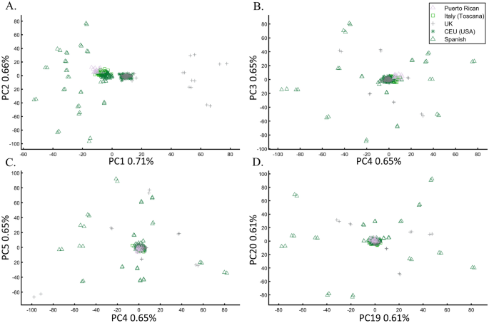
To further assess whether PCA clustering represents shared ancestry or biogeography, two of the most common applications of PCA, e.g., Ref.22, we applied PCA to 20 Puerto Ricans (Fig. 15) and 300 Europeans. The Puerto Ricans clustered indistinguishably with Europeans (by contrast to Fig. 12) using the first two and higher PCs (Fig. 15). The Puerto Ricans represented over 6% of the cohort, sufficient to generate a stratification bias in an association study. We tested that by randomly assigning case–control labels to the European samples with all the Puerto Ricans as controls. We then generated causal alleles to the evenly-sized cohorts and computed the association before and after PCA adjustment. We repeated the analysis with randomly assigned labels to all the samples. In all our 12 case–control analyses, the outcome of the PCA adjustment for 2 and 10 PCs were worse than the unadjusted results, i.e., PCA adjusted results had more false positives, fewer true positives, and weaker p-values than the unadjusted results (Supplementary Text 3).
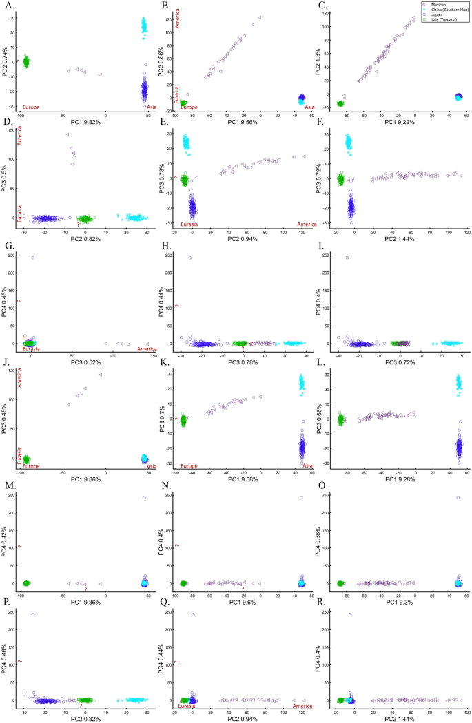
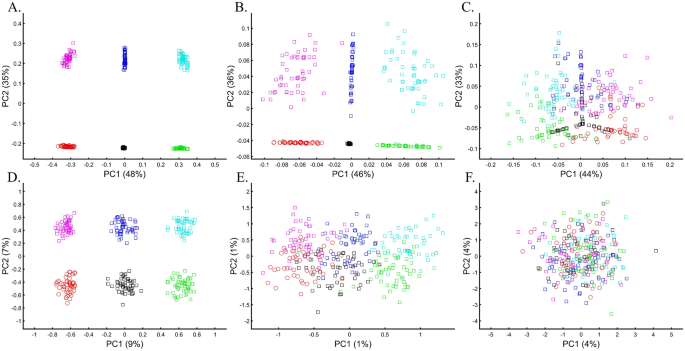
We next assessed whether the distance between individuals and populations is a meaningful biological or demographic quantity by studying the relationships between Chinese and Japanese, a question of major interest in the literature58,59. We already applied PCA to Chinese and Japanese, using Europeans as an outgroup (Supplementary Fig. S2.4). The only element that varied in the following analyses was the number of Mexicans as the second outgroup (5, 25, and 50). We found that the proportion of homogeneous Japanese and Chinese clusters dropped from 100% (Fig. 16A) to 93.33% (Fig. 16B) and 40% (Fig. 16C), demonstrating that the genetic distances between Chinese and Japanese depend entirely on the number of Mexicans in the cohort rather than the actual genetic relationships between these populations as one may expect.
Some authors consider higher PCs informative and advise considering these PCs alongside the first two. In our case, however, these PCs were not only susceptible to bias due to the addition of Mexicans but also exhibited the exact opposite pattern observed by the primary PCs (e.g., Fig. 16G–I). It has also been suggested that in datasets with ancestry differences between samples, axes of variation often have a geographic interpretation10. Accordingly, the addition of Mexicans altered the order of axes of variation between the cases, making the analysis of additional PCs valuable. We demonstrate that this is not always the case. Excepting PC1, over 60% of the axes had no geographical interpretation or an incorrect one. An a priori knowledge of the current distribution of the population was essential to differentiate these cases. The addition of the first 20 Mexicans replaced the second axis of variation (initially undefined) with a third axis (Eurasia-America) in the middle and right columns and resulted in a minor decline of ~ 5% of the homogeneous clusters. Adding 25 Mexicans to the second cohort did not affect the axes, but the proportion of homogeneous clusters declined by 66%. The axes changes were unexpected and altered the interpretation of PCA results. Such changes were not detectable without an a priori knolwedge.
These results demonstrate that (1) the observable distances (and thereby clusters) between populations inferred from PCA plots (Figs. 14, 15, 16) are artifacts of the cohort and do not provide meaningful biological or historical information, (2) that distances betewen samples can be easily manipulated by the experimenter in a way that produces unpredictable results, (3) that considering higher PCs produces conflicting patterns, which are difficult to reconcile and interpret, and (4) that our extensive “exploration” of PCA solutions to Chinese and Japanese relationships using 18 scatterplots and four PCs produced no insight. It is easy to see that the multitude of conflicting results, allows the experimenter to select the favorable solution that reflects their a priori knowledge.
The case of projections
Incorporating precalculated PCA is done by projecting the PCA results calculated for the first dataset onto the second one, e.g., Ref.17. Here, we tested the accuracy of this approach by projecting one or more color populations onto precalculated color populations that may or may not match the projected ones. The accuracy of the results was dependent on the identity of the populations of the two cohorts. When the same populations were analyzed, they overlapped (Fig. 17A), but when unique populations were found in the two datasets, PCA created misleading matches (Figs. 17B–D). In the latter case, and when the sample sizes were uneven (Fig. 17C), the projected samples formed clusters with the wrong populations, and their positioning in the plot was incorrect. Overall, we found that PCA projections are unreliable and misleading, with correct outcomes indistinguishable from incorrect ones.
To evaluate the reliability of projections for human populations, we tested whether the projected populations cluster with their closest groups and to what extent these results can be manipulated. We found that populations can be shown to correctly align with continental populations when the base (or test) populations and the projected populations are very similar (Fig. 18A), which gives us confidence in the accuracy of PCA projections. However, even in the simplest scenario of using three continental populations, it is unclear how to interpret the overlap between the base and projected populations since the Spanish would not be considered genetically closer to Finns than Italians, as suggested by PCA. In another simple scenario, where Europeans are projected onto other Europeans, distinct populations like AJs, Iberians, French, CEU, and British overlap entirely (Fig. 18B), whereas Finns and Italians were separate. Not only do the results share no apparent resemblance to the geographical distribution, but they also produce conflicting information as to the genetic distances between these populations—two properties that PCA enthusiastics claim it represents. Adding more populations, even if only to the projected populations, contributes to further distortions with previously distinct populations (Fig. 18B) now clustering (Fig. 18C). In a different dataset, projecting Japanese onto a base dataset of Africans and Europeans places them as an admixed African-European population. The projected Finns cluster with other Europeans (Fig. 18D), at odds with the previous results (Fig. 18B) that singled them out.
To test the behavior of PCA when projecting populations different from the base populations, we projected Chinese, Finns, Indians, and AJs onto Levantine and two European populations (Fig. 18E). The results imply that the Chinese and AJs are of an Indian origin originating from a European-Levantine mix. Replacing Levantines with Africans does not stabilize the projected results (Fig. 18F). Now the projected Chinese and Japanese overlap, and AJs cluster with Iranians.
Overall, our results show that it is unfeasible to rely on PCA projections, particularly in studies involving different populations, as is commonly done. Even when the projected populations are identical to the base ones, the base and projected populations may or may not overlap.
The case of ancient DNA
PCA is the primary tool in paleogenomics, where ancient samples are initially identified based on their clustering with modern or other ancient samples. Here, a wide variety of strategies is employed. In some studies, ancient and modern samples are combined60. In other studies, PCA is performed separately for each ancient individual and “particular reference samples”, and the PC loadings are combined61. Some authors projected present-day human populations onto the top two principal components defined by ancient hominins (and non-humans)62. The most common strategy is to project ancient DNA onto the top two principal components defined by modern-day populations14. Here, we will investigate the accuracy of this strategy.
Since ancient populations show more genetic diversity than modern ones14, we defined “ancient colors” (a) as brighter colors whose allele frequency is 0.95 with an SD of 0.05 and “modern colors” (m) as darker colors whose allele frequency is 0.6 with an SD of 0.02. Two approaches were used in analyzing the two datasets: calculating PCA separately for the two datasets and presenting the results jointly (Fig. 19A,B), and projecting the PCA results of the “ancient” populations onto the “modern” ones (Fig. 19C,D). In both cases, meaningful results would show the ancient colors clustering close to their modern counterparts in distances corresponding to their true distances.
These are indeed the results of PCA when even-sized “modern” and “ancient” samples from color populations are analyzed and the color pallett is balanced (Fig. 19A). In the more realistic scenario where the color pallet is imbalanced and sample sizes differ, PCA produced incorrect results where ancient Green (aGreen) clustered with modern Yellow (mYellow) away from its closest mGreen that clustered close to aRed. mPurple appeared as 4-ways mixed of aRed, aBlue, mCyan, and mDark Blue. Instead of being at the center (Fig. 19A), Black became an outgroup and its distances to the other colors were distorted (Fig. 19B). Projecting “ancient” colors onto “modern” ones also highly misrepresented the relationships among the ancient samples as aRed overlapped with aBlue or aGreen, mYellow appeared closer to mCyan or aRed, and the outgroups continuously changed (Fig. 19C,D). Note that the first two PCs of the last results explained most of the variance (89%) of all anlyses.
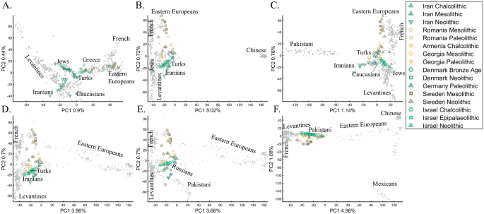
Recently, Lazaridis et al.14 projected ancient Eurasians onto modern-day Eurasians and reported that ancient samples from Israel clustered at one end of the Near Eastern “cline” and ancient Iranians at the other, close to modern-day Jews. Insights from the positions of the ancient populations were then used in their admixture modeling that supposedly confirmed the PCA results. To test whether the authors’ inferences were correct and to what extent those PCA results are unique, we used similar modern and ancient populations to replicate the results of Lazaridis et al.14 (Fig. 20A). By adding the modern-day populations that Lazaridis et al.14 omitted, we found that the ancient Levantines cluster with Turks (Fig. 20B), Caucasians (Fig. 20C), Iranians (Fig. 20D), Russians (Fig. 20E), and Pakistani (Fig. 20F) populations. The overlap between the ancient Levantines and other populations also varied widely, whereas they cluster with ancient Iranians and Anatolians, Caucasians, or alone, as a “population isolate.” Moreover, the remaining ancient populations exhibited conflicting results inconsistent with our understanding of their origins. Mesolithic and Neolithic Swedes, for instance, clustered with modern Eastern Europeans (Fig. 20A–C) or remotely from them (Fig. 20D–F). These examples show the wide variety of results and interpretations possible to generate with ancient populations projected onto modern ones. Lazaridis et al.’s14 results are neither the only possible ones nor do they explain the most variation. It is difficult to justify Lazaridis et al.’s14 preference for the first outcome where the first two components explained only 1.35% of the variation (in our replication analysis. Lazaridis et al. omitted the proportion of explained variation) (Fig. 20A), compared to all the alternative outcomes that explained a much larger portion of the variation (1.92–6.06%).
We note that for high dimensionality data where markers are in high LD, projected samples tend to “shrink,” i.e., move towards the center of the plot. Corrections to this phenomenon have been proposed in the literature, e.g., Ref.63. This phenomenon does not affect our datasets, which are very small (Fig. 19) or LD pruned (Fig. 20).
The case of marker choice
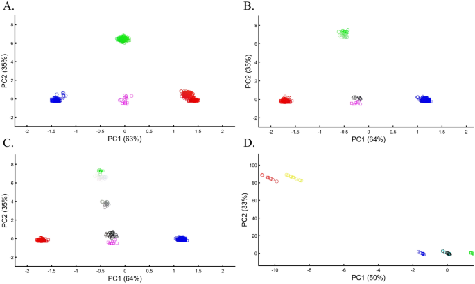
The effect of marker choice on PCA results received little attention in the literature. Although PCA is routinely applied to different SNP sets, the PCs are typically deemed comparable. In forensic applications, that typically employ 100–300 markers, this is a major problem. To evaluate the effect of various markers on PCA outcomes, it is unfeasible to use our color model, although it can be used to study the effects of missing data and noise, which are common in genomic datasets and reflect the biological properties of different marker types in capturing the population structure. Remarkably, the addition of 50% (Fig. 21A) and even 90% missingness (Fig. 21B) allowed recovering the original population structure. The structure decayed when random noise was added to the latter dataset (Fig. 21C). To further explore the effect of noise, we added random markers to the dataset. An addition of 10% of noisy markers increased the dataset's disparity, but it still retained the original structure (Fig. 21D). Interestingly, even adding 100% noisy markers allowed identifying the original structure's key features (Fig. 21E). Only when adding 1000%, noisy markers did the original structure disappear (Fig. 21F). Note that the introduction of noise has also sliced the percent of variation explained by the PCs. These results highlight the importance of using ancestry informative markers (AIMs) to uncover the true structure of the dataset and accounting for disruptive markers.
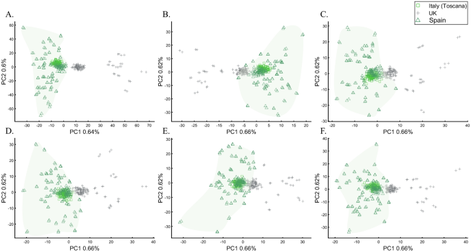
To evaluate the extent to which marker types represent the population structure, we studied the relationships between UK British and other Europeans (Italians and Iberians) using different types of 30,000 SNPs, a number of similar magnitude to the number of SNPs analyzed by some groups64,65. According to the full SNP set, the British do not overlap with Europeans (Fig. 22A). However, coding SNPs show considerable overlap (Fig. 22B) compared with intronic SNPs (Fig. 22C). Protein coding SNPs, RNA molecules, and upstream or downstream SNPs (Fig. 22D–F, respectively) also show small overlap. The identification of “outliers,” already a subjective measure, may also differ based on the proportions of each marker type. These results not only illustrate how the choice of markers and populations profoundly affect PCA results but also the difficulties in recovering the population structure in exome datasets. Overall, different marker types represent the population structure differently.
The case of inferring a personal ancestry
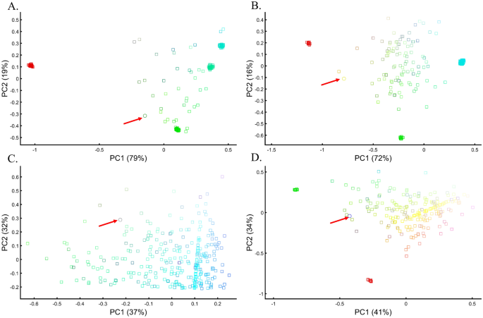
PCA is used to infer the ancestry of individuals for various purposes, however a minimal sample size of one, may be even more subjected to biases than in population studies. We found that such biases can occur when individuals with Green (Fig. 23A) and Yellow (Fig. 23B) ancestries clustered near admixed Cyan individuals and Orange, rather than with Greens or by themselves, respectively. One Grey individual clustered with Cyan (Fig. 23C) when it is the only available population, much like a Blue sample clustered with Green samples (Figs. 23D).
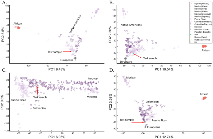
Arguably, one of the most famous cases of personal ancestral inference occurred during the 2020 US presidential primaries when a candidate published the outcome of their genetic test undertaken by Carlos Bustamante that tested their Native American ancestry (https://elizabethwarren.com/wp-content/uploads/2018/10/Bustamante_Report_2018.pdf). Analyzing 764,958 SNPs, Bustamante sought to test the existence of Native American ancestry using populations from the 1000 Genomes Project and Amerindians. RFMix66 was used to identify Native American ancestry segments and PCA, elevated to be a “machine learning technique,” to verify that ancestry independently of RFMix. The longest of five genetic segments, judged to be of Native American origin, was analyzed using PCA and reported to be “clearly distinct from segments of European ancestry” and “strongly associated with Native American ancestry” as it clustered with Native Americans distinctly from Europeans and Africans (Fig. 1 in their report) and between Native American samples (Fig. 2 in their report). Bustamante concluded that “While the vast majority of the individual’s ancestry is European, the results strongly support the existence of an unadmixed Native American ancestor in the individual’s pedigree, likely in the range of 6–10 generations ago”.
We have already shown that AJs (Fig. 9C) and Pakistanis (Fig. 14D) can cluster with Native Americans. With the candidate’s DNA unavailable (and their specific European ancestry undisclosed), we tested whether the two PCA patterns observed by Bustamante can be reproduced for modern-day Eurasians without any reported Native American ancestry (Pakistani, Iranian, Even Russian, and Moscow Russian) (Figs. 24A–D, respectively).
These analyses show that the experimenter can easily generate desired patterns to support personal ancestral claims, making PCA an unreliable and misleading tool to infer personal ancestry. We further question the accuracy of Bustamante’s report, provided the biased reference population panel used by RFMix to infer the DNA segments with the alleged Amerindian origin, which excluded East European and North Eurasian populations. We draw no conclusions about the candidate’s ancestry.
/ione-elementary-school-janitor-becomes-principal-083122-2-d9f3428ec0cd4ec8995f6726d7c737c8.jpg)


